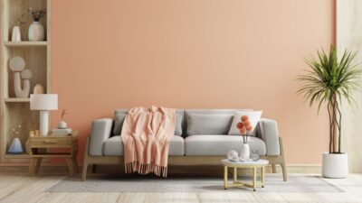
As we approach the start of spring, you may be thinking about all of the projects around the house that you can finally start when warmer weather arrives – opening up the pool, adding those perennial flower beds to your lawn, or perhaps changing up your wall colours.
If you’re thinking about adding a fresh coat of paint to your interior spaces, why not take some inspiration from the most influential paint brands around?
Here are the 2024 colours of the year:
Pantone: Peach Fuzz (13-1023)
This warm and cozy shade of pink evokes “our desire to nurture ourselves and others,” according to Pantone. A lighter and softer hue compared to 2023’s Viva Magenta, Peach Fuzz promotes a sense of welcoming and comfort, making it an ideal colour for relaxation spaces, such as a bedroom or living room. Peach Fuzz pairs well with similar hues of pink, maroons and purples, or jewel tones.
Behr: Cracked Pepper (PPU18-01)
Designed to promote feelings of “confidence and individuality,” this versatile soft black created by Behr can be easily paired with a variety of colour swatches. Whether you’re looking for a dark accent wall in your living area, or a bold statement shade in the dining room, Cracked Pepper transcends various interior design trends, textures and moods.
Sherwin-Williams: Upward (SW 6239)
If you want a room to feel like a breath of fresh air, then adding Upward to your walls is the way to go. This silvery-blue hue feels light and breezy, stimulating feelings of calmness and creativity. Sherwin-Williams recommends complimenting this soft blue with grays, melon green or deep shades of navy.
Glidden: Limitless (PPG 1091-3)
Breaking away from typical shades of gray and white, Glidden has proclaimed Limitless as the new go-to neutral. This soft yellow is said to liven up spaces with ease, complimenting both warm and cool colours, whether you choose to pair Limitless with an earthy green, warm beige or rust-coloured red. It’s a colour for all seasons.
Benjamin Moore: Blue Nova (CC-860)
Borrowing inspiration from “the hues experienced through travels and moments that span beyond routine,” this Benjamin Moore bold blue can be used in both modern and traditional interiors. Blue Nova is well-suited for pairing with shades of ivory, burnt orange or colourful pastels.